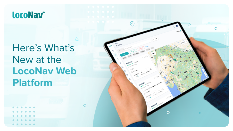

LocoNav is dedicated to providing a positive platform experience for every customer and user. That is why, with each product release, we are committed to exploring new ways to improve our users’ experiences. Today, we are delighted to announce the release of our brand-new User Interface (UI), which is designed to improve user productivity, enable straightforward platform administration, and maintain consistency of user experience across all LocoNav products.

NEW FEATURES SUMMARY:
- All the great things you love about LocoNav plus new solutions like Route Deviation and Driver Scorecards.
- Cutting across cultures and languages – a truly global, AI-driven fleet tech platform that everyone in your team can use from the get-go.
- Navigation moved to the left panel for easy access to all features on the platform.
With new features, icons, and styles, we’ve overhauled the look and feel of our platform. The upgraded styles are not only visually appealing but they are also intended to be aligned with our primary purpose, which is to improve user experience. This makes navigating the LocoNav platform easier and more efficient.
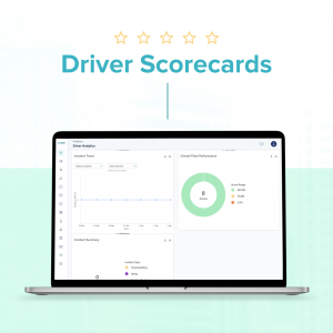
The new exciting solutions include Route Deviation and Driver Scorecards. A driver scorecard assists in calculating strategic risk scores based on important indicators such as speeding, forceful braking, over-acceleration, and unauthorized vehicle use.
 As for Route Deviation, in the event that a vehicle deviates from the assigned route for a trip, an alert gets triggered which notifies the fleet manager of the same, and he/she can immediately look into it or contact the driver to get an update.
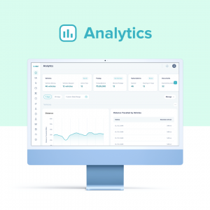
The section headings are now simpler to read, redesigned icons lead the eye to the most important facts, and improved button styles and colors logically indicate the next step a user needs to take to glide through their driver and fleet analytics. The choice of the revamped icons has been made keeping in mind the scenario where every person in your organization is easily able to access the platform.
Some features that were difficult to locate in the sub-menus of the old UI have been repositioned. Therefore, the ‘Services’ and ‘Settings’ navigation menus have also been optimized by unifying the navigation location. The navigation bar is now located on the left panel, rather than the top panel, as it was previously.
Via customer feedback, we have inferred that the majority of users preferred to standardize the location of the navigation menu across all portals, while some found the location of settings options unclear. As a result, we prominently displayed them on the left hand of the screen. This is one example of a principle that will be used across the new UI – streamlining the interface and navigation for all users.
Both existing and new customers will be sent to the redesigned UI by default upon logging in, which remains the same.